


Hi there, strap yourself in and hold on tight, get ready to experience heart-pounding excitement as you master the complexities of CSS animations.
Animations make your websites more lively to view and can be done without using any Framework or library. It lets an element gradually change from one style to another. It involves changing position, moving, and manipulating your HTML elements.
How It Works
Define the CSS animation rule using Keyframes
Include it in the HTML to be animated.
To use CSS animations you must first specify the keyframes for the animation and its sub-properties. This allows you to program the timing, duration, and specify the order in which the animation should unfold
The @Keyframes rule
When you specify CSS styles inside the @keyframes rule, the animation will progressively transition from the current style to the new style at specific moments during the sequence.
The @Keyframe Sub-Properties
animation-name- This property specifies the name of the @keyframes rule describing the animation’s styles.animation-duration- This property defines how long an animation takes to complete. If the animation-duration is undefined, the animation will not be displayed, because the default value is 0s.animation-delay- This property specifies a delay for the start of an animation, This allows you to specify a delay before the animation starts, giving you control over the timing of the animationanimation-iteration-count- This property specifies the number of times an animation should run. You can set the animation to infinite to make the animation continue forever
<div> </div>
/*This is the animation code*/
@keyframes sample{
    from {background-color: green;}
    to {background-color: red;}
}

/*This is the style for the element that wants to be animated*/
div{
  width: 100px;
  height: 100px;
  border-radius: 50%;
  background-color: green;
  animation-name: sample;
  animation-duration: 1s;
  animation-delay: 2s;
  animation-iteration-count: infinite;
}
animation-direction- This property specifies whether an animation should play normally or in alternate directions. This property contains four values which areNormal - The animation is played forward. This is the default direction
alternate - The animation is played forwards first, then backward
alternate-reverse - The animation is played backward first, then forwards.
reverse- The animation is played in the reverse direction, backward.
animation-timing-function: This property specifies the speed curve of the animation, it enables you to control and vary the acceleration of an animation that is, it defines where the animation speeds up and slows down over the specified duration. It can be used to create smooth and realistic animation effects, as well as more stylized and abstract ones. The animation-timing-function can be specified using a variety of keywords:ease:specifies an animation with a slow start, then fast, then end slowly (this is the default)ease-out:specifies an animation with a slow end.linear:specifies an animation with the same speed from start to end.ease-in:specifies an animation with a slow start.ease-in-out:specifies an animation with a slow start and end.cubic-bezier(n,n,n,n):This lets you define your own values for the speed using the Cubic Bezier Function
animation-fill-mode:This property specifies how an animation should apply styles to its target element before and after it is executed. It can be used to preserve the styles of an element after the animation has completed, or to reset the styles of an element before the animation begins.There are several possible values for the animation-fill-mode property:
none:This is the default value. It means that the animation will not apply any styles to the element before or after it is executed.forwards:This value causes the animation to apply the styles that are set in the final keyframe to the element after the animation has been completed.backward:This value causes the animation to apply the styles that are set in the first keyframe to the element before the animation begin
animation-play-state:This property specifies whether an animation is running or paused. It can be used to pause and resume an animation, or to start an animation in a paused state. There are two possible values for theanimation-play-stateproperty:running: this value specifies that the animation is running. This is the default.paused:This specifies that the animation is paused.
Animation Shorthand Property.
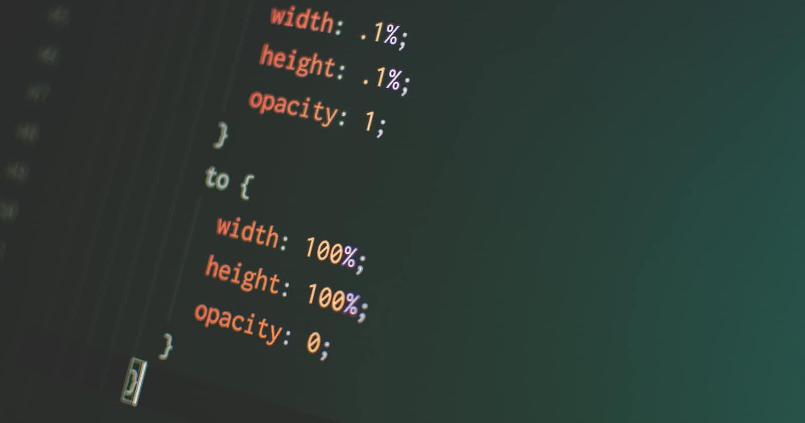
This can be done using percentages
animation: animation-name animation-duration animation-fill-mode animation-delay animation-iteration-count animation-direction;
To get a clearer picture here's an example using all of the animation properties below.
HTML Code
<section>
  <div class="circle">
    <span>   FORTWIN  </span>
  </div>
</section>
CSS Code
@keyframes circle{
    from {background-color: #ffbb00;}
    to {background-color: rgb(0, 110, 255);}

    0%{ transform: scale(.9);}
}

  /* The element to apply the animation to */
 .circle {
    width: 200px;
    height: 200px;
    border-radius: 20%;
    font-weight: bold;
    font-size: 2rem;
    font-family: cursive;
    position: relative;
    display: flex;
    text-align: center;
    margin: 50px auto;
    align-items: center;
    justify-content: center;
    color: #fff;
    background-color: blue;

    /* The animation properties*/
    animation-name: circle;
    animation-duration: 1s;
    animation-direction:alternate-reverse;
    animation-timing-function: ease-in-out;
    animation-iteration-count: infinite;
    animation-fill-mode: both;
    animation-delay: 2s;
    animation-play-state: running;
}
The Code Output
The transform : scale() CSS function is used to stretch or shrink an element in two dimensions. You can use the transform: scale() function to create interesting effects in your web page layouts, such as animating the size of an element when it is hovered over or clicked. It is often used together with other CSS transforms, such as rotate and translate.
You can find more CSS animation references here: